Case Study: Raithon E-Commerce
Role: UX/UI Designer
Timeline: 4 Weeks, 2025
Tools: Figma, Adobe Photoshop
Focus: E-commerce, Branding, Responsive Design
Overview
Raithon is an e-commerce platform built specifically for gamers. The goal: create an intuitive, high-impact web and mobile experience that resonates with a niche audience obsessed with performance, aesthetics, and speed. Built during my design bootcamp, this project allowed me to dive deep into research, branding, and e-commerce UX principles.
Problem
Most gamer gear stores are either outdated or overwhelming, filled with cluttered interfaces and a lack of visual identity. There’s a gap in the market for an experience that feels as sharp, immersive, and clean as the equipment it sells.
Goals
Build a brand identity that feels modern and gamer-centric
Design a seamless purchasing experience
Create a responsive layout that works on both desktop and mobile
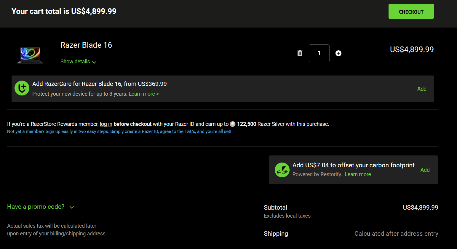
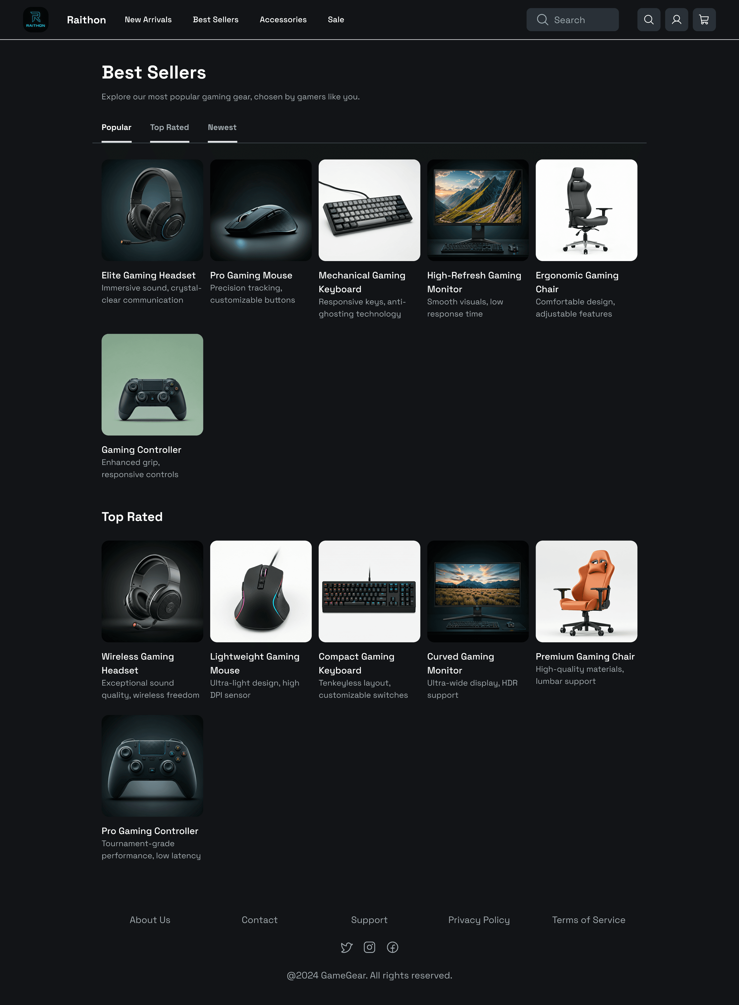
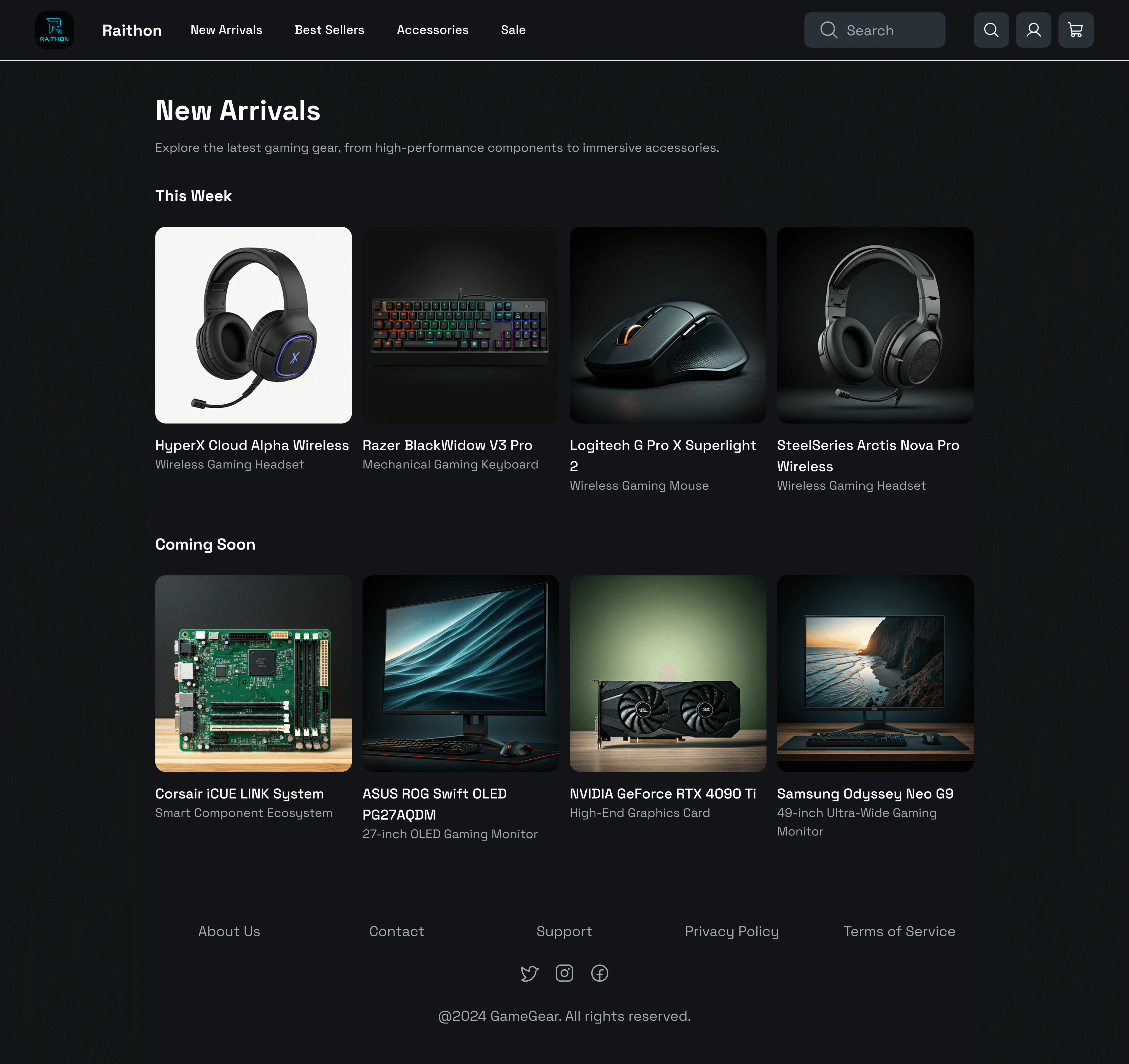
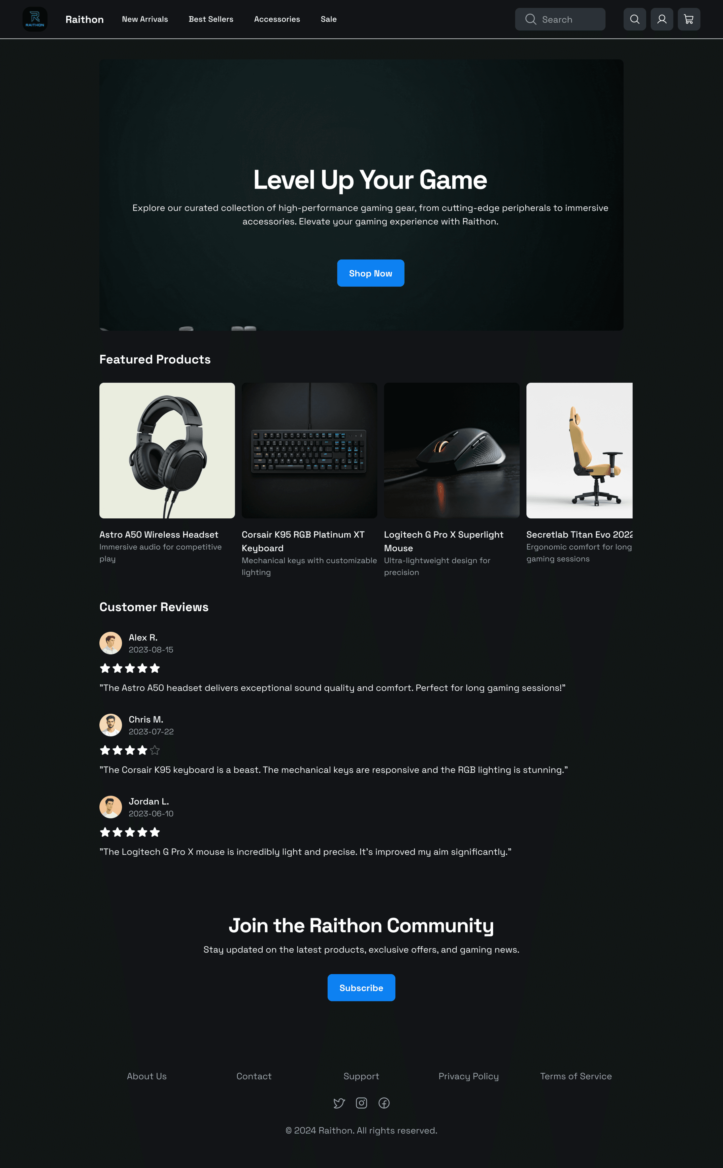
Key Features
Personalized product recommendations
Sticky navigation with real-time cart updates
Immersive product pages with high-res imagery and hover interactions
Fast, minimal checkout
User Flow Chart
To ensure a seamless user experience, I created a user flow diagram outlining the primary navigation paths across the website. This helped define the most efficient journey from landing on the homepage to completing a purchase.
Outcome
This project strengthened my ability to design for commerce and conversion without sacrificing visual edge. I built an experience gamers would actually want to use and not just tolerate. It showcased my ability to combine branding, UX strategy, and visual polish.
My Process
1. Research
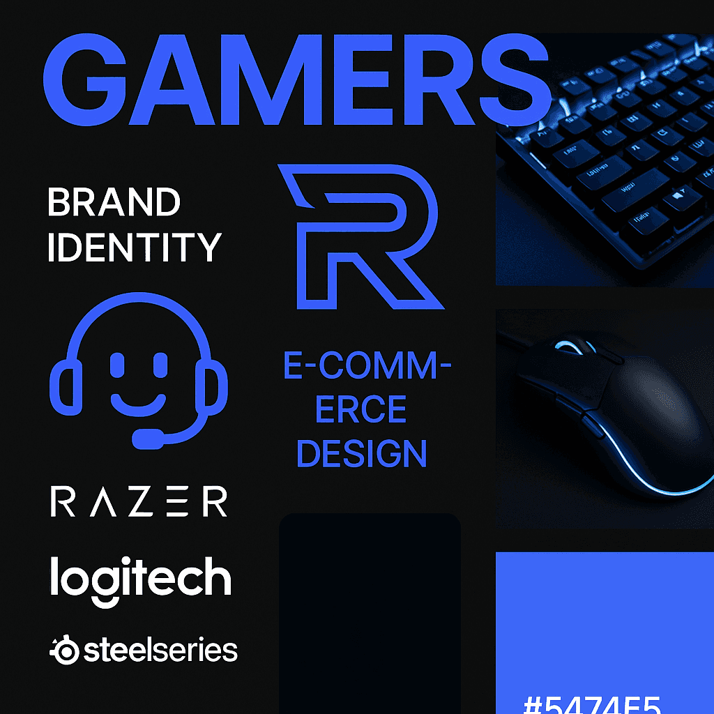
I conducted competitive analysis of gaming e-commerce stores like Razer, Logitech, and SteelSeries. I also conducted interviewed with real gamers to understand pain points.
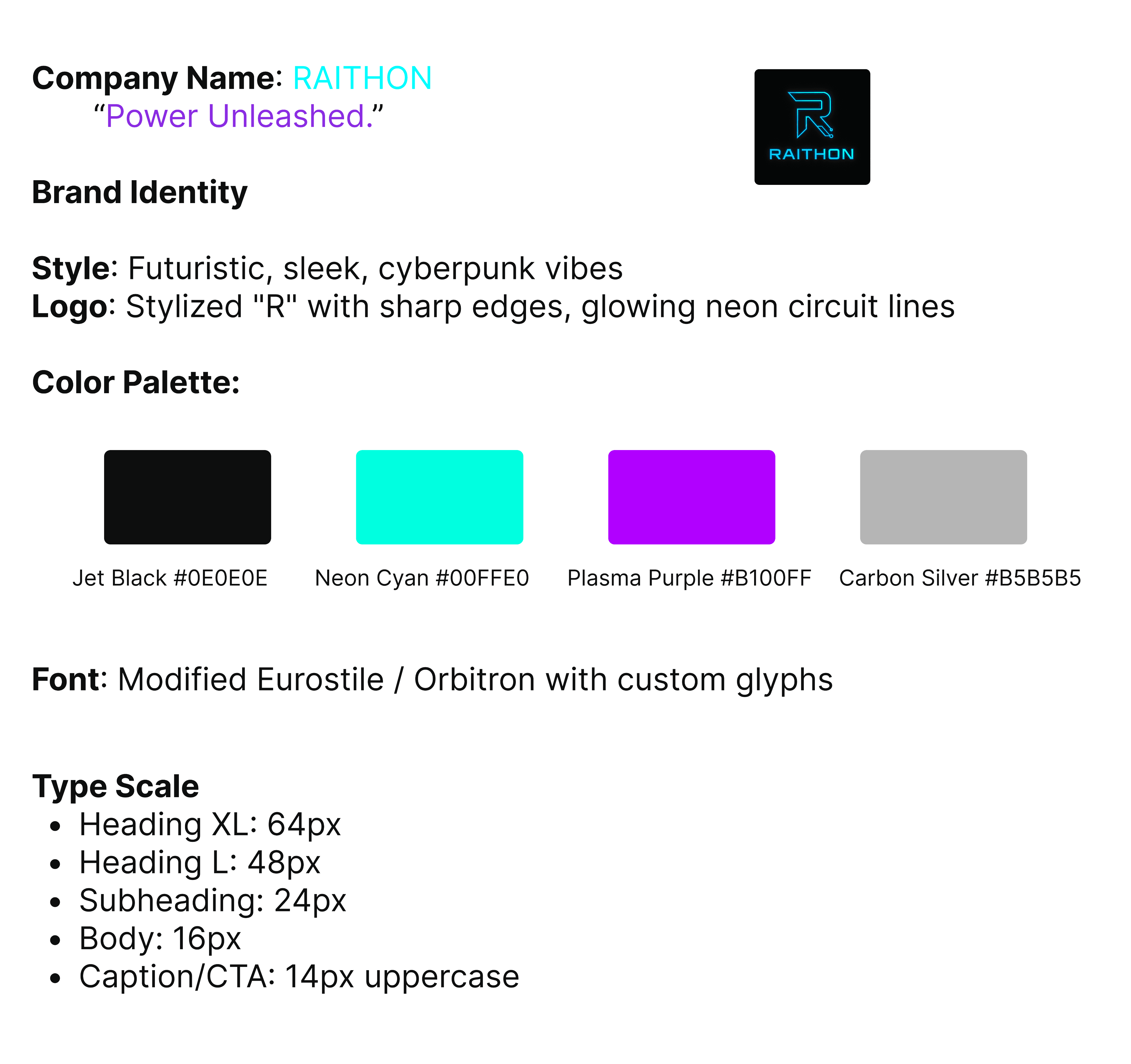
2. Brand Development
Inspired by tech aesthetics and competitive edge, the brand uses: a bold, neon-accented color palette. A sharp, monogram-style “R” logo and sleek typography that reflects both functionality and flair
3. Wireframes to High-Fidelity
I designed wireframes for the Homepage, Product detail page, Cart & checkout and Mobile variants. Once tested and refined, I created high-fidelity screens using a dark theme with electric blue highlights.
4. Prototyping
Built interactive prototypes in Figma to test user flows, particularly:
Add-to-cart behavior
Navigating product categories
Completing checkout in under 3 steps


Style Guide and mood board
To establish a cohesive and immersive experience for Raithon, I created a visual style that reflects the brand’s bold, high-performance identity. The design system supports clarity, accessibility, and ease of navigation while appealing to gamers through edge and energy.

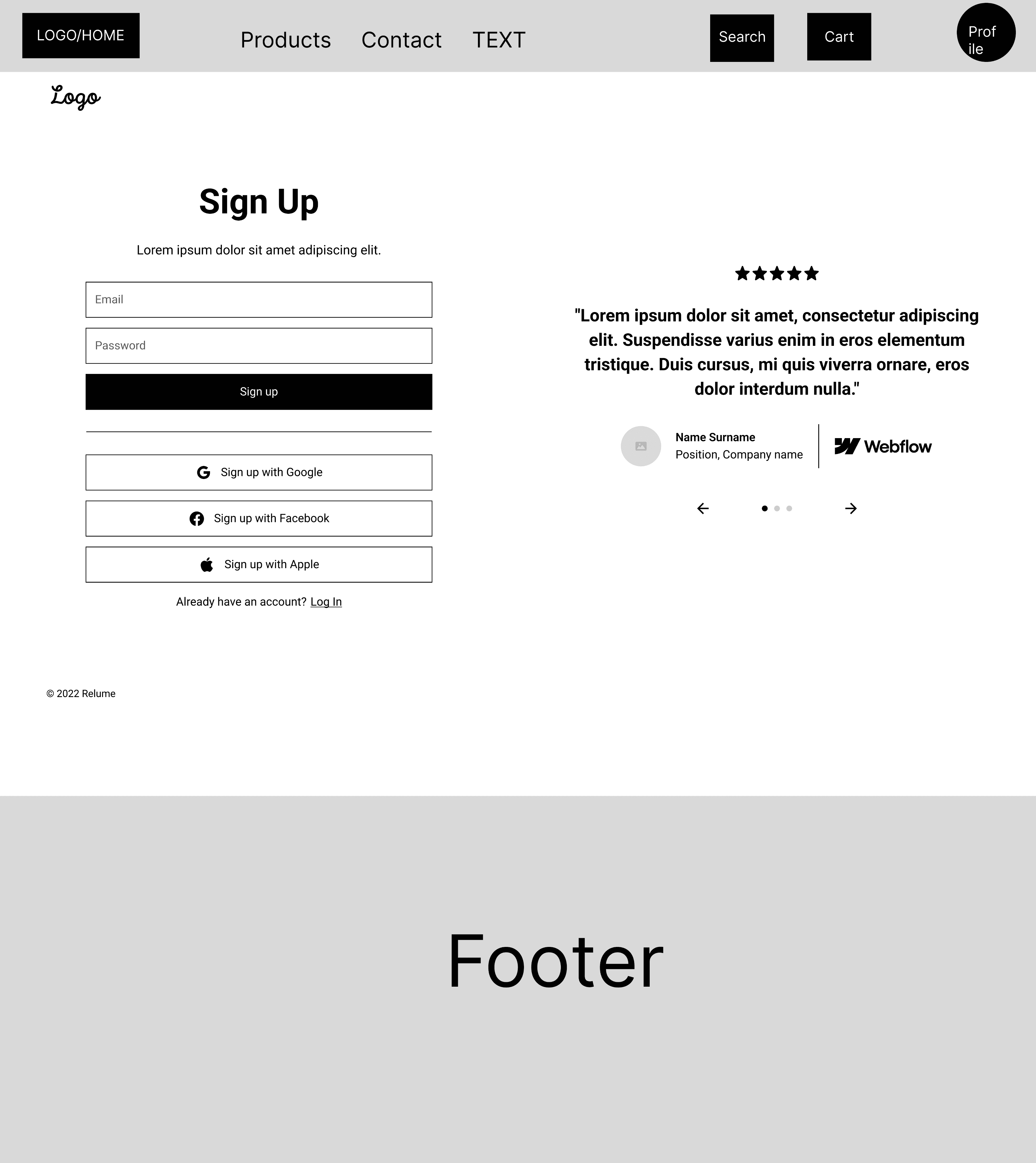
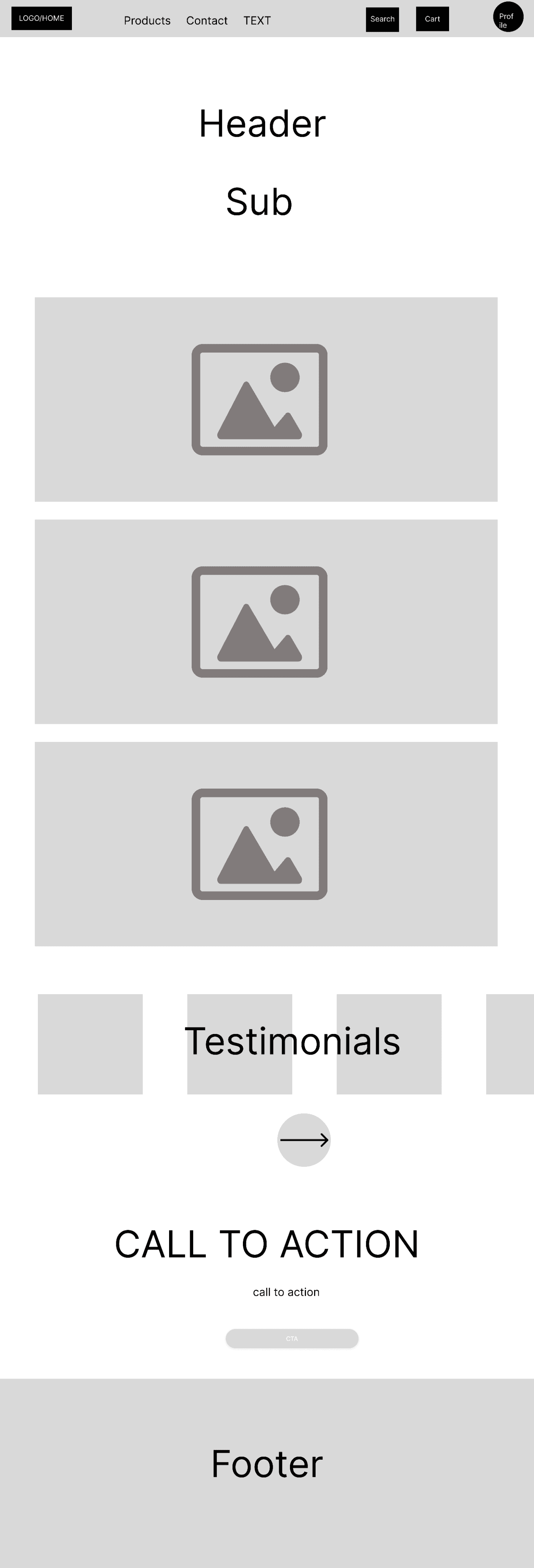
Low Fidelity WireFrames
Final Designs