Role: Lead UX/UI Designer
Timeline: Bootcamp Project, 2025
Tools: Figma, Photoshop
Focus: E-commerce, Branding, Responsive Design
Overview
Raithon is a concept e-commerce platform built specifically for gamers. The goal: create an intuitive, high-impact web and mobile experience that resonates with a niche audience obsessed with performance, aesthetics, and speed. Built during my design bootcamp, this project allowed me to dive deep into research, branding, and e-commerce UX principles.
Problem
Most gamer gear stores are either outdated or overwhelming, filled with cluttered interfaces and a lack of visual identity. There’s a gap in the market for an experience that feels as sharp, immersive, and clean as the equipment it sells.
Goals
Build a brand identity that feels modern and gamer-centric
Design a seamless purchasing experience
Create a responsive layout that works on both desktop and mobile
Establish trust and credibility through visual design
Key Features
Personalized product recommendations
Sticky navigation with real-time cart updates
Immersive product pages with high-res imagery and hover interactions
Fast, minimal checkout
Outcome
This project strengthened my ability to design for commerce and conversion without sacrificing visual edge. I built an experience gamers would actually want to use — not just tolerate. It showcased my ability to combine branding, UX strategy, and visual polish.
My Process
1. Research
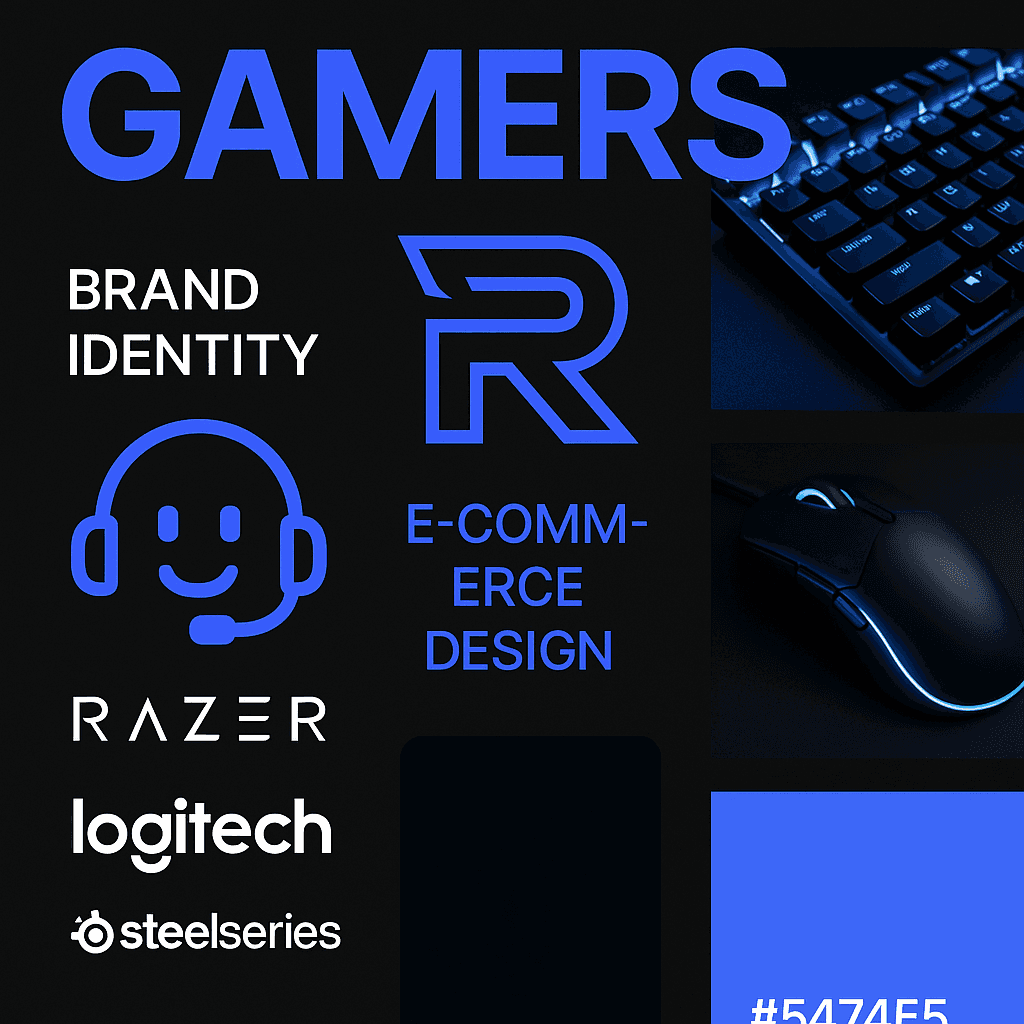
I conducted competitive analysis of gaming e-commerce stores like Razer, Logitech, and SteelSeries
Surveys and informal interviews with real gamers to understand pain points
Persona creation based on key motivations (speed, quality, customization)
2. Brand Development
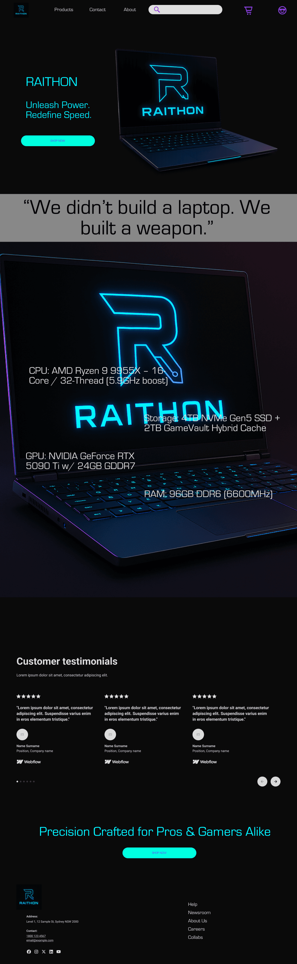
Inspired by tech aesthetics and competitive edge, the identity uses: A bold, neon-accented color palette
A sharp, monogram-style “R” logo
Sleek typography that reflects both functionality and flair
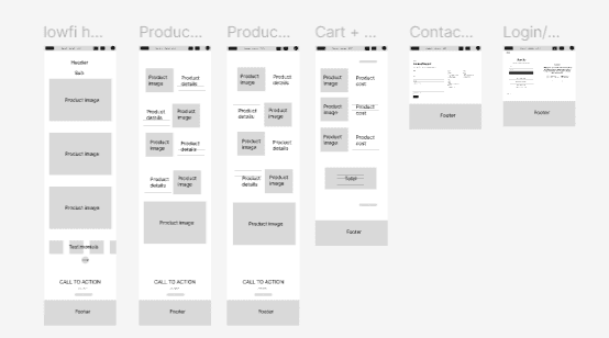
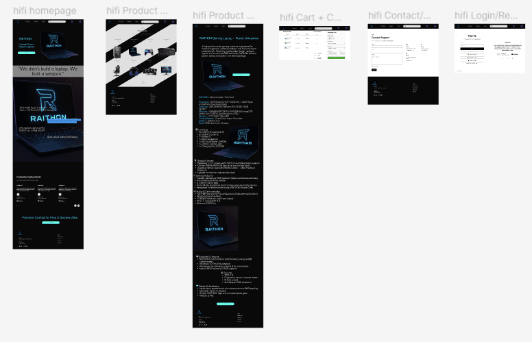
3. Wireframes to High-Fidelity
I designed wireframes for:
Homepage
Product detail page
Cart & checkout
Mobile variants
Once tested and refined, I created high-fidelity screens using a dark theme with electric blue highlights.
4. Prototyping
Built interactive prototypes in Figma to test user flows, particularly:
Add-to-cart behavior
Navigating product categories
Completing checkout in under 3 steps